TAG Heuer has just introduced the third of the five Limited Edition chronographs that will mark the 50th Anniversary of the Heuer Monaco. Each of these five models represents the themes, styles and trends of a particular decade in the life of the Monaco, with this third model representing the style of the 1990s. (For our thoughts on TAG Heuer’s approach to these Special Editions, see our posting, Birthdays, Anniversaries and Other Celebrations — Thoughts on TAG Heuer’s 50th Anniversary Monacos.)
The Special Edition for the 1990s
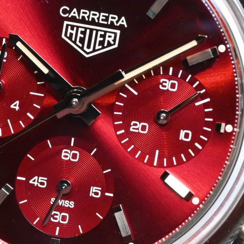
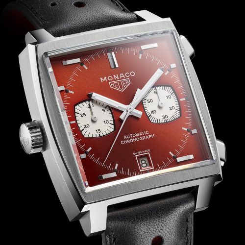
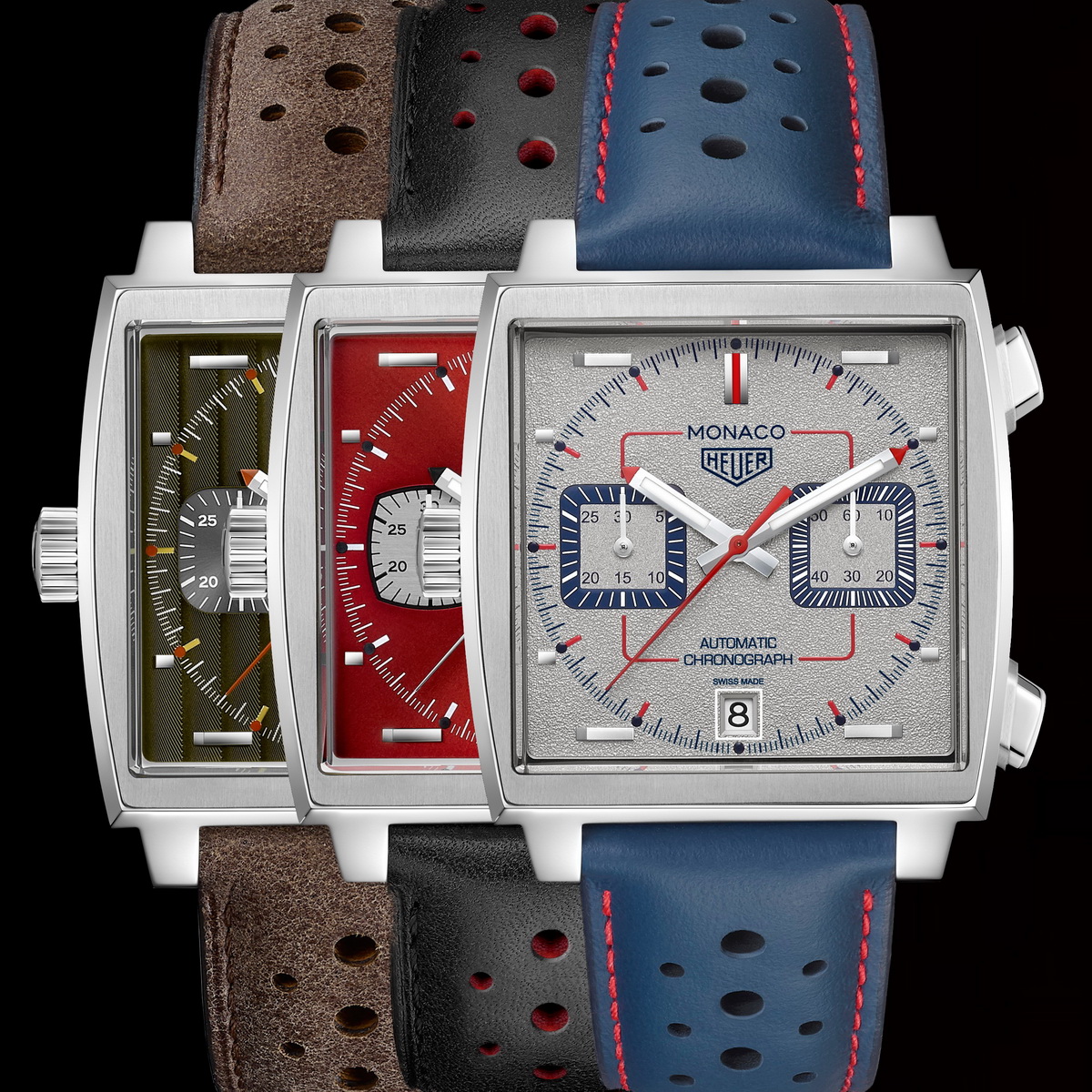
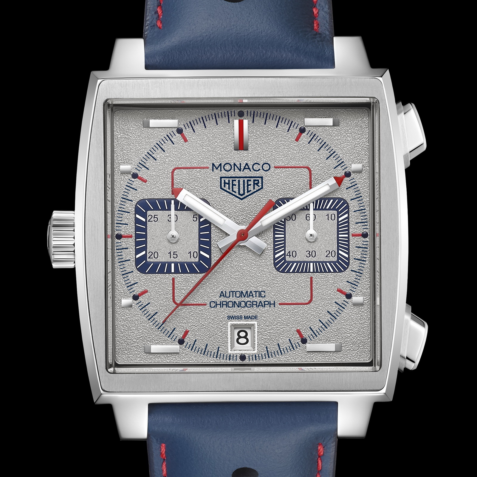
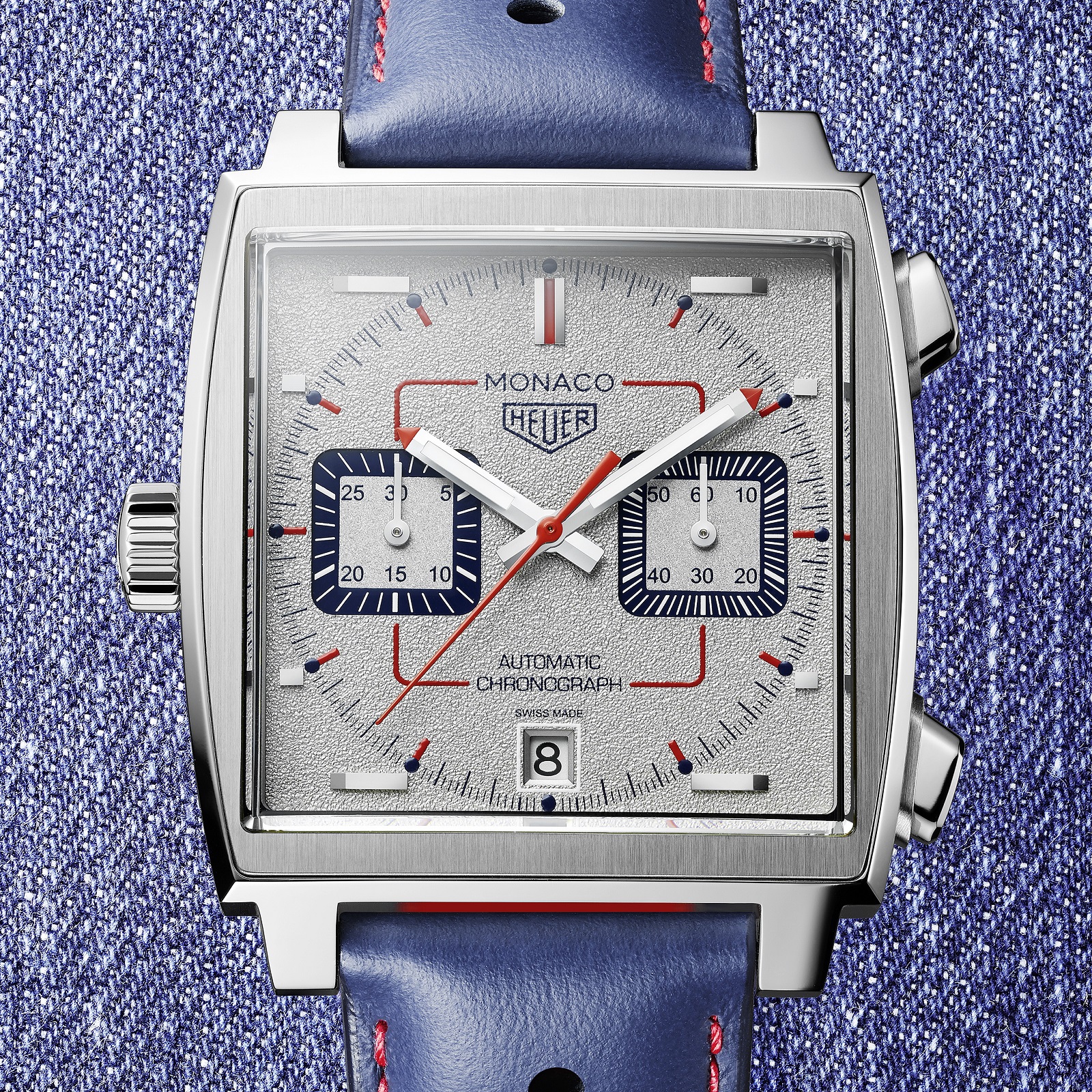
TAG Heuer suggests that the “industrial appearance” of this third Special Edition represents the street style characteristic of the decade. The watch features a blue and silvery appearance with dynamic red elements. The dial has a grained rhodium-plated dial finish, with sandblasted registers, with blue “tracks” around the edges of the registers. The blue / red theme continues with the special leather strap.
In the texture of the dial, the Special Edition Monaco for the 1990s takes a different approach from the previous two Special Editions (green for the 1970s and blood red for the 1980s). For the 1990s model, the dial has a textured, “orange peel” finish. This texture appears to be similar to that used for the Autavia Isograph, except that the texture of the Monaco is more extreme and is not graduated. It appears that the texture of the registers is different from that of the main surface of the dial.
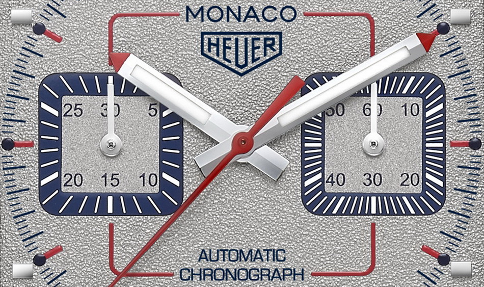
Dial accents are done in blue and red, which look good with each other (as on the original Steve McQueen Monacos) and with the gray dial. Blue is used for a solid track around the registers, for the lume dots on the dial, and the inner flange between the dial and the crystal. The printing for “Monaco” has changed from the detailed serifs of the first two Special Editions, to the simpler sans serif, that would have been more common in the 1990s.
Red is used for the indices, the tips of the hands and the chronograph second hand. There is also a red “rounded square” line, mimicking the shape of the registers, that connects the “Monaco” and Heuer shield at the top of the dial, to the registers, and then to the “Automatic Chronograph” printed at the bottom of the dial. This is a nice touch, that emphasized the geometry of the Monaco and pulls together the various areas of the dial.
As with the two previous models, the Special Edition for the 1990s will be limited to 169 pieces, priced at around $6,500. Based on the instant sell-outs of the first two models, we can assume that by the time you are reading this, the third model will have been sold-out.
. . . and Then There Were Three
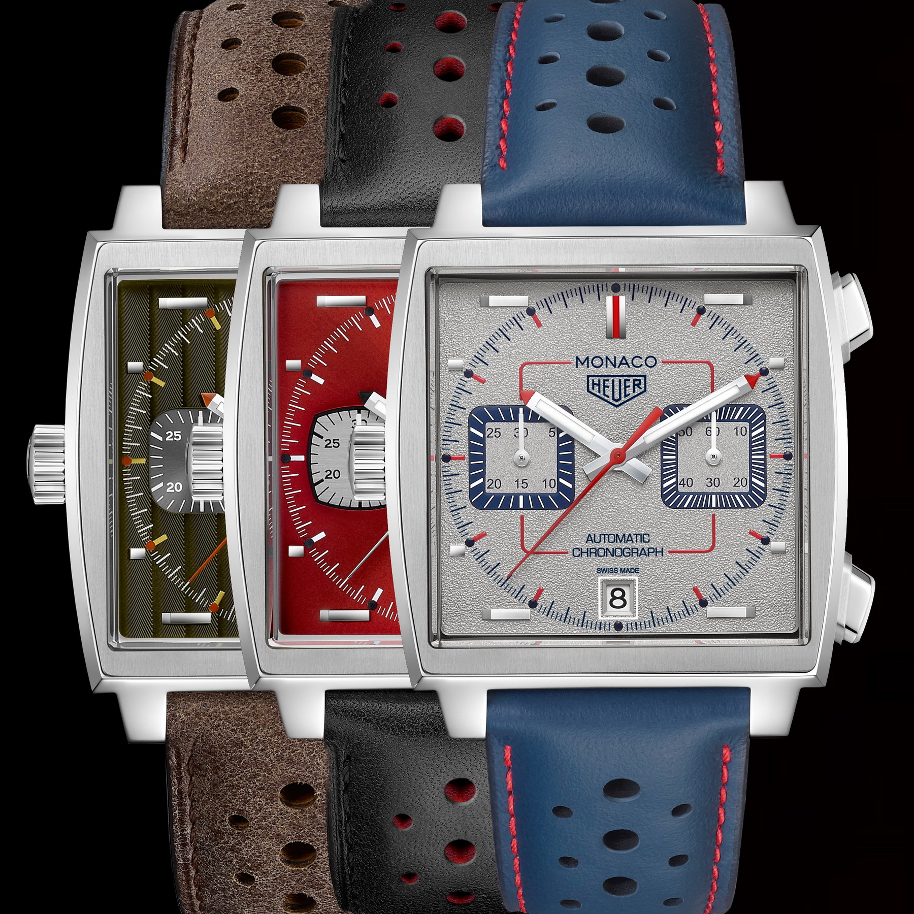
Now that TAG Heuer has introduced three of the five Special Editions for the 50th Anniversary of the Monaco, it is interesting to look at the watches, as a group. Essentially, these three Special Editions are the same chronographs as the Calibre 11 Monaco that was introduced 10 years ago, for the 40th anniversary of the Monaco, with three special dials.
Looking at the dials, we see three very different colors and textures, demonstrating just how versatile the Monaco can be. There is strong contrast between the green, red and gray colors, but the differences in the paint colors are only the beginning. The green dial, for the 1970s, has the Cotes de Geneve finish (as was used in some Carreras of the era), that shows brown and yellow, in different lights and from different angles. The lume is somewhere between amber and yellow, with deep orange for the lume dots.
For the 1980s, TAG Heuer used a blood red with a starburst finish, but also modified the registers to become a “rounded square”. The lume dots on the dial and the tips of the hands are black, very different from the usual approach to lume, but very dramatic. The finish is smooth, distinctive from the exotic textures of the other two models.
Power in Numbers
As TAG Heuer introduced the first and second Special Editions, back in May and June, the styles of the dials seemed somewhat random. Why this crazy green dial, with the texture of an old sofa, to represent the 1970s? And was red really the color to represent the 1980s? With the introduction of the third Special Edition for the 1990s, the group of watches makes more sense to me.
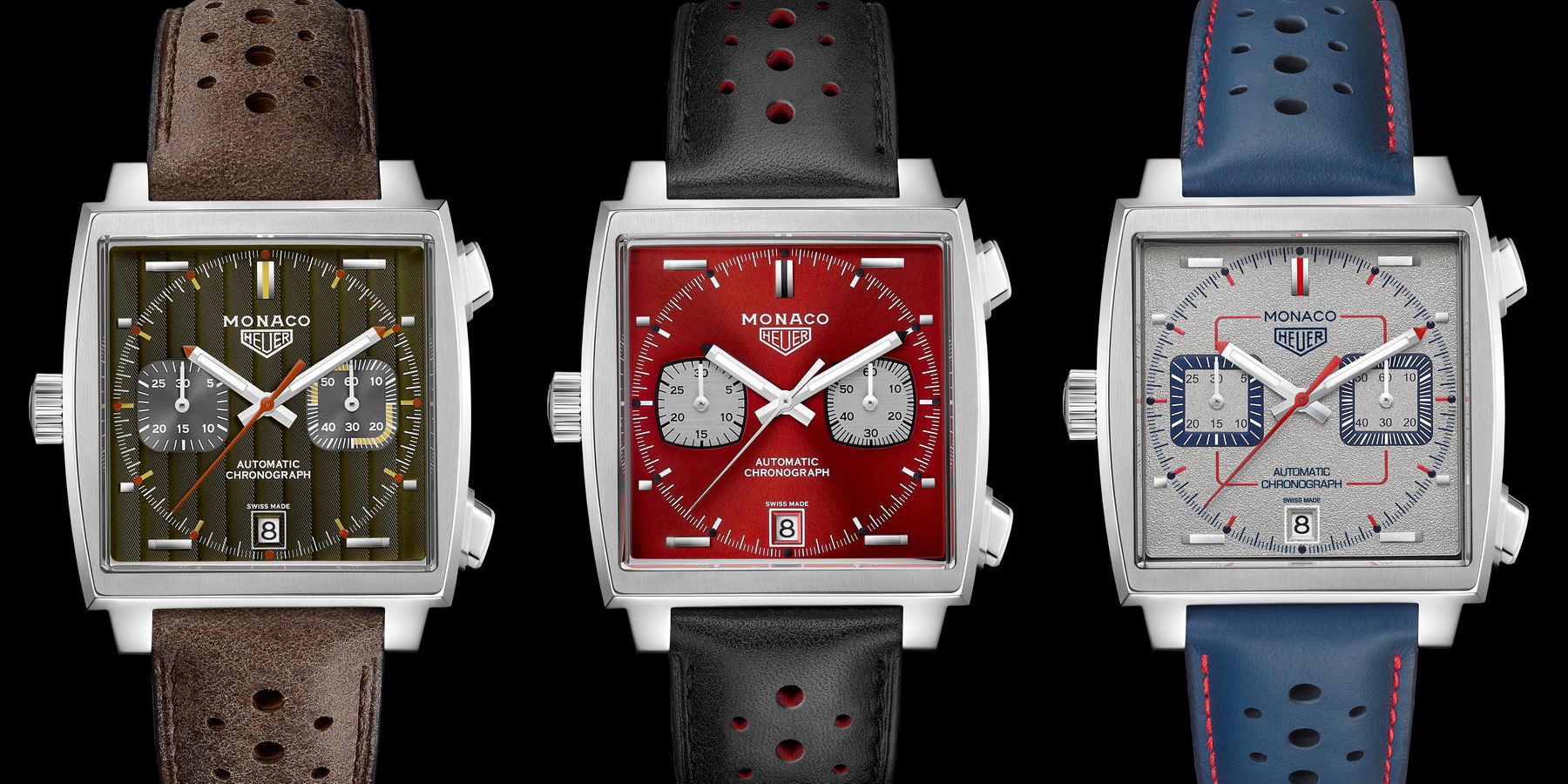
Collectively, these three Special Edition Monacos show that the dial of the Monaco can serve as an interesting palette for TAG Heuer to blend and mix colors, and to experiment with bold designs. Not only do we see three different colors, but we see three different textures, different construction of the registers, and different styles of decoration. We see rounded circles, hash marks forming circles, and even different fonts for the magical word, “Monaco”.
While my choice would have been to use the dial of the Monaco to convey the imagery of racing — colors, stripes, arrows or gears, for example — seeing the three Special Editions together, I can now appreciate TAG Heuer’s choice to use the dials to represent the style of five decades. In the end, the Monaco is a brilliant form factor to house a chronograph that will fit well on the wrist, while conveying the enthusiast’s personal “brand”. We have seen three very different looks, all of which will attract new Monaco enthusiasts.
With that, I applaud these first three Special Editions and enthusiastically await the introduction of the fourth and fifth models.